Affixed to the underside of the awning that covers the entryway to Selby Gardens are alternating planes of dots. Painted in cheery tones of red, yellow and blue, these architectural dressings blend in well enough that even regular visitors might wonder if they have been there all along, but not so well as to suggest that reality is humming along as usual. Once inside the tropical conservatory, a placard on a stand displays text inside a comic book dialogue bubble and poses an absurd question that begins to explain this slight blip in reality: What happens when Roy Lichtenstein enters Claude Monet’s garden at Giverny?
To even pose that question is in and of itself a bit crazy, but to answer it requires a boundless imagination with a touch of madness. When Selby Gardens stirred their wizardly cauldron and concocted the exhibition called Roy Lichtenstein: Monet’s Garden Goes Pop!, they posed and answered that very question. The immersive exhibition picks up where last year’s Salvador Dalí: Gardens of the Mind left off.

“After last year’s [Dalí] exhibition, so many people said to me, ‘Oh, you have to do Monet’s garden’,” says CEO Jennifer Rominiecki. But that seemed too easy, too expected. The Dalí show saw the gardens strewn with the surrealist whimsy that formed his roster of recurring motifs, but in the case of Monet, there is nothing particularly thought-provoking about planting flowers in a garden already bursting with them. The work of Lichtenstein provided the twist Rominiecki needed. Lichtenstein’s most famous works—and, incidentally,
his most critically polarizing—were his large-scale renderings of comic book scenes painted in hard, flat colors and lines. He also popularized the use of Ben-Day dots as a way to add color in a mechanized way. But his subversion of popular cultural artifacts also extended to some of his lesser-known works, including a collection of large mixed-media pieces that reimagined Monet’s garden paintings in a playful pop aesthetic. “Lichtenstein considered Monet’s masterworks so popular that he thought he could do his own version in a mass-produced, commercialized style,” says Rominiecki, “and those paintings sort of playfully eviscerate Monet’s work in good fun.”

And it’s that very sense of parody that Selby Gardens used as the basis for the exhibition’s reality-questioning vignettes scattered throughout the garden grounds.
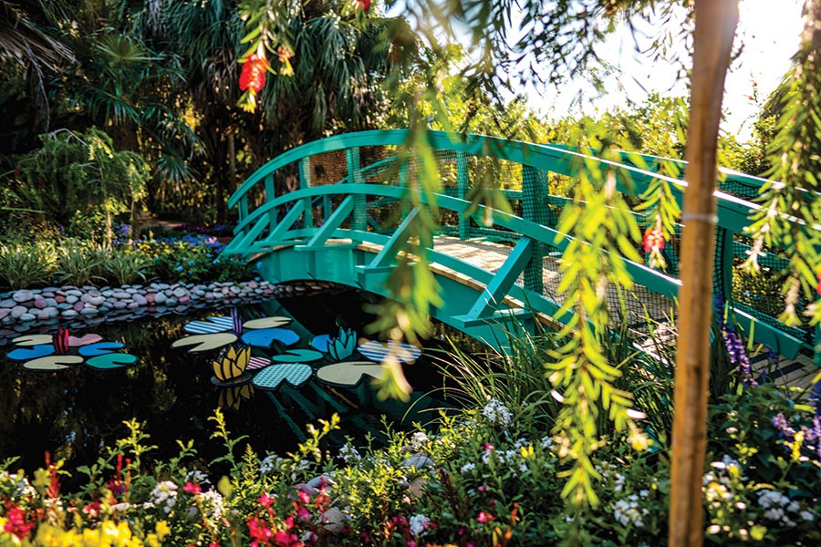
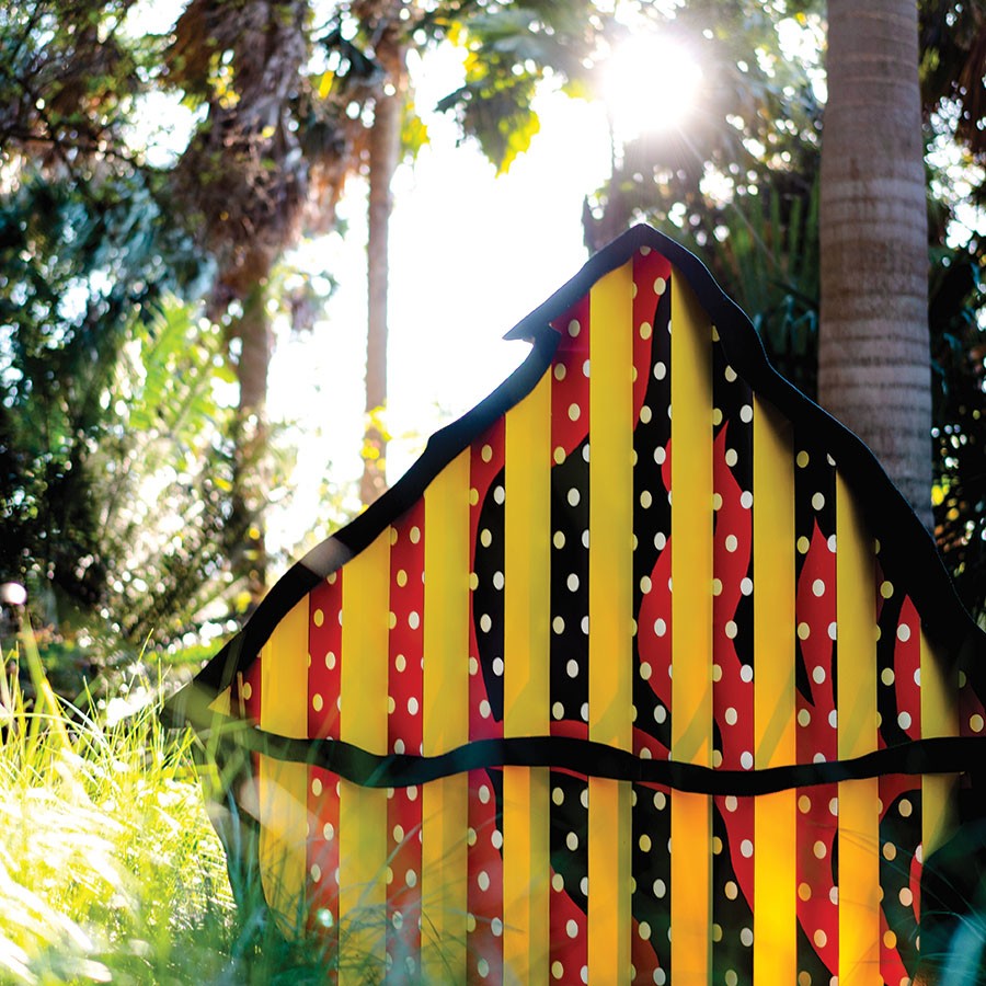
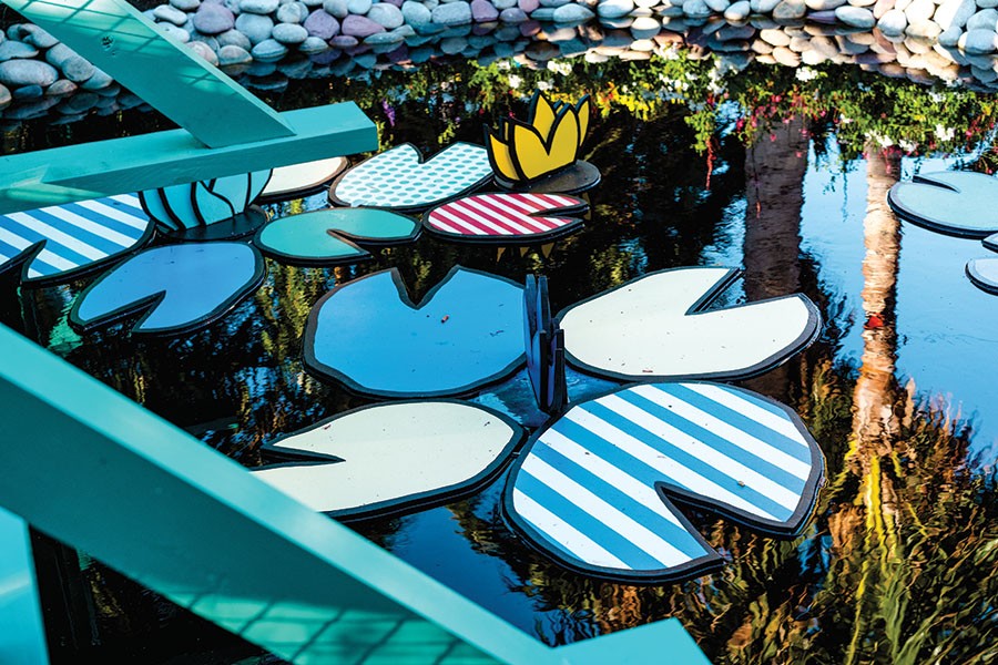
“What we did was take a lot of the recurring elements of Monet’s work and represented them in a Lichtenstein style,” says Mike McLaughlin, senior VP of site operations and horticulture. Over the koi pond, a reimagining of Monet’s Water Lilies and Japanese Bridge in which the arched bridge is constructed as a two-dimensional structure and the water lilies in the graphical style of Lichtenstein. A koi fish colored with Ben-Day dots exclaims, “GULP!” in a comic book action graphic. The motif of lilies and bridges continues throughout the grounds along with benches painted in the turquoise of Monet’s bridge at Giverny. Near the mangrove walkway, a massive replica of the facade of Monet’s home features the flat colors and thick black outlines that characterize the style of Lichtenstein.

The Lichtenstein motifs certainly pop (pun intended), but never to the point of obstructing the natural beauty that springs from the ground. Each two-dimensional element is couched within the lushness of color and texture that Monet sought to capture in his impressionist work and that he cultivated in real life at his home. “We really tried to have fun with this one,” says McLaughlin, “so everything is cartoon-like even though we did a lot of research on Monet’s home and Lichtenstein’s work.”
If the outdoor vignettes highlight the “living” half of Selby Gardens’ “Living Museum” trademark, then the inside expresses the “museum” half. Dimly lit to protect the sensitive pieces, the Museum of Botany & Arts sports several pieces from Lichtenstein’s “Water Lilies with Reflections” series. Three large screen prints on metal reimagine Monet’s most famous subject matter in the cartoonish, industrial style of Lichtenstein, with reflective materials and paints poking fun at the exquisitely gentle gradients in Monet’s work. “At first glance, you might think Monet’s paintings and Lichtenstein’s copies are totally different,” says Rominiecki, “but in both styles, the subject really only takes shape as you move further away from them.” This is especially true for Lichtenstein’s Haystack parodies, rendered in Ben-Day dots and in their unique way almost approaching abstract.

As a whole, the exhibition’s indoor and outdoor features are part of the gardens’ goal to go beyond the one-and-done novelty of the typical botanical garden attraction. “What we’ve been trying to do with exhibitions like this is give people something unexpected,” says Rominiecki, “and it’s about putting our visitors in dialogue with different disciplines. In this case, we wanted to immerse our guests in this surprising juxtaposition that still feels familiar.” SRQ


